In addition to being our class project, Parth and I will enter this into the Southsure Emerging Artist Awards. We're turning in our best efforts today but will have another go at it in a few days to refine our mistakes.
12 ROTOSCOPED SEQUENCES. OUTRAGEOUS!!!!!
I will count how many frames that amounted to and update this blog later with Bold and underlined words. I was able to figure out a way for Parth to help me with the rotoscoping: he isolated the sequences in after effects, turned them black and white and them exported them into PSD files. That saved me a few hours of cutting and sorting, which was much appreciated.
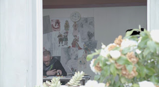 |
| Harder than it looks and a terrible result. It was deemed "acceptable" by Parth, which I'll take. |
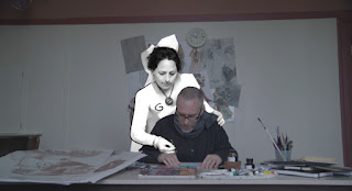 |
| This scene was going to be 375 frames long but I asked Parth to cut it down to 100 as there was no way I could finish the rotoscoping in time. |
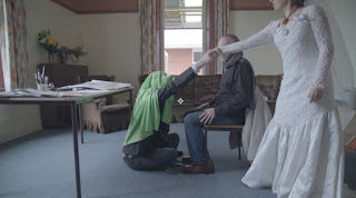 |
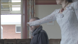
| original shot: I thought that covering Josh's head in greenscreen fabric would help. Not so much. The clean shot didn't match up, so the masking shot idea was scrapped last week. Instead, vaughn showed me how to size up the shot to naturally mask out Josh.
|
Except, in the last second of the shot, the green can be seen. So I took 1/3 of the left of a shot early in the sequence where you can't see Josh and used it as a mask. The rotoscoping was going over the top anyway, and it completely covered him. I'm sure that there was a higher tech way of achieving that effect, but it was too late at night to figure it out. Hooray for layers. Because it worked.
 |
| "clean" png layer |
 |
| on top of the action layer |
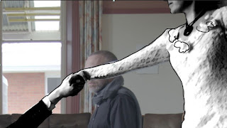 |
| and under the rotoscope layer |
I also need to brag on how I figured out how to match the original footage (which had to be resurrected to get the right shot length) and the segment Vaughn sized up for me. I put both sequences into the same composition and copied the transform? details from the sized up to the original footage and voila, it was all the same size and matched the rotoscoping. Because eyeballing it and playing with proportions wasn't cutting it.
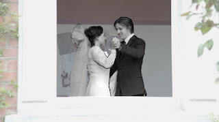 |
| Next best special effect: making Josh's long, curly hair look like a short haircut. Not the most stylish by any means, but should pass by anyone who doesn't know Josh. |
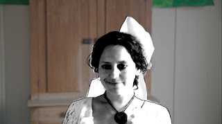 |
| I thought that drawing in some of the loose hairs at the side of her face would look good, but I was wrong; it is unintentionally hilarious to have them wagging at all times during this shot. I will fix this for our Southsure entry. |


No comments:
Post a Comment