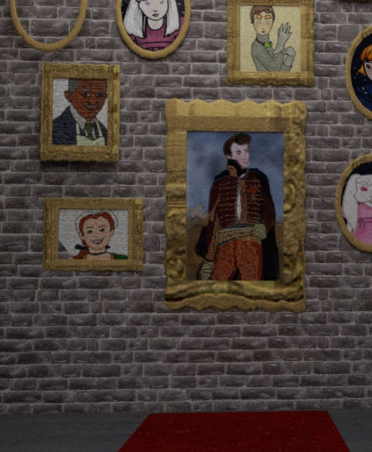
Look at this! It's looking VERY bumpy and bricky now. I had a very nice session with Rachel today learning about the Arnold renderer, making bump, normal and specular maps to increase the depth of my textures, and lighting. Each renderer changes the look of the scene and Arnold looks very nice indeed. It also renders what the camera sees so I won't need to remove everything off-screen before sending the scene for rendering. That will save heaps of time and effort.
Photoshop makes normal and bumps maps super fast from the original file. Create a new layer and then under the filter menu, open 3D and then choose generate bump or normal map. Voila.
When the normal map was loaded into the brick node system in Maya, it went very pale which we discovered was due to the red and green channels needing to be inverted. Since a little bit of reflection was needed on the high points of the brick and not the grout, a new brick layer was created and desaturated then darkened up until only little specks of grey would be seen. This was named brick_spec.tga and loaded in under specular settings. The brick was changed from a blinn to an aiStandard1 which gives more choices.
Lighting is always it's own large and separate undertaking. There will be floating light sources on some of the aisles and in general, the mood should be of a darkish warehouse with lights high above the aisles and most things in shadow. This will create good separation between the background and the characters, who are quite colourful. It's going to be great!
Split screen view to see objects without and with texture and lighting.
My preferences were set to the grid plane being on centimeters. Once that went up to meters per square, the whole set was grouped and then scaled up to fit. That meant the cameras can move around easier and I can look around from the perspective of a small girl.


No comments:
Post a Comment