- the white boxes are 25% opacity (so the white is stronger) instead of 12%. I will test print one to make sure the text is more legible. If it isn't, I will ever move back to 12% opacity and change the text to white or move to 50% opacity. Something will work! Maybe I should print all three of those options and ask around.
- I added 4cm to one side of the image depending on where it is in the book. I didn't allow for the bind last time and this should solve that problem.
- I moved any white boxes and text on pages that appear on the left to the outside margins so nothing gets trapped in the binding.
In addition to fixing technical issues, I am doing more research on what pitch bibles can look like.
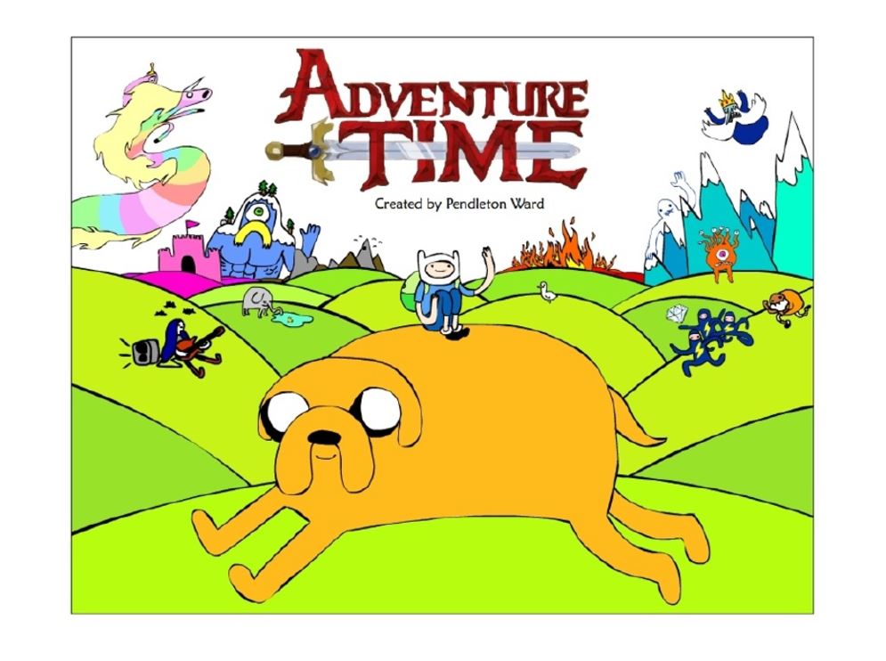


The Adventure Time pitch bible does something very interesting- it's full of illustrations and concept art and lots and lots of text about the feeling of the characters and world. By the time you get to the summary of 4 episodes, you already know what to expect from the show.
This one is fun and funny. It starts out as a comic, showing most of the main characters, then moves into the pitch. There is lots and lots of back story and explanations of people's emotional arcs over the series.


What's great about both of these bibles is that each page is different- you keep reading to see all the possibilities. Mine follows a pattern and it's easy to do one quick FLIIIIIPPP and then move on. No reason to examine anything very closely.
No comments:
Post a Comment