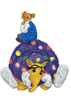
My exhibition space looks like this:
I've arranged them vertically on the wall to the give an adult viewer the perspective of a child looking up. Do the silhouettes and colours read well? Are they engaging? When the characters are in chaos, as they are in the center piece, do they visually hold their own? I can see that no, that isn't the case because the rabbit is too close in colour to the girl. Giving the rabbit more contrast or readjusting the whole group's colours may be necessary.
 |
| Exhibition 1 artist statement |
These two new character plates were also left out of the exhibition:
This is phase 2 in the development of my characters and I'm very pleased! Instead of being made from fabric or craft fur, the characters will be made from piles of stuff that relates to their role on the show. These photo-collages suggest two possible animation methods- 3D or the puppet technique favoured by Little Airplane Productions, one of my artist models.
Goldie the binge-eating hamster eats when she's upset. Her food obsession is front and center in this design where she's made from pasta and meatballs. As a 3D construction, the conglomerate nature of her materials will be evident (empty space showing through the noodles) and she will casually, or frantically, be able to eat herself. Flash is no longer a time-obsessed rabbit but is Super-Connected (that wording may change) who can't unplug from his devices long enough to catch what's happening around him. His new tech savvy characteristics mean cyber safety and cyber bullying can be discussed as well as taking the time to interact with people in real life to understand what they're saying.
I'm still honing the core group of characters and developing their looks. I'm replacing the crocodile with a tuatara, and would like to see how a Kea and the Pekapeka bat could be incorporated. Juliet Novena-Sorrel had an excellent idea this weekend- turn the hamster into a possum. Love it, I will push Goldie even further and make her a relatable animal to the New Zealand AND Australian market. I decided to leave these new character designs out of the exhibition because I'm still working on them and I want to put them out in public when I have a full set for people to react to.
For exhibition 2, I will have more characters than I need and can take commentary from the public on which looks and characteristics resonate with them in response to the overall story. The girl and the armadillo are SET and no more than four (No, five! Nearly forgot Dr. Picklesniffer) other full-time characters will join them.


No comments:
Post a Comment